Slim Appeal: 5 Successful Book Spines
The “Don’t Judge a Book by Its Cover” war has been over for a while now, with everyone conceding that while a cover isn’t always an indicator of what’s inside, an aesthetically pleasing one can certainly make a child (/33 year old school librarian) want to read it.
That’s all well and good for books that are displayed face out, but what about books that aren’t shiny and new and given the opportunity to show their cover to the world? The books that are on the shelf, a slim spine amid a sea of others?
I gave an award for Spine of the Year once, but today I want to focus on five spines that stand out, and (I think) get read more often because of it.

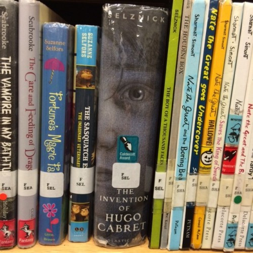
Description: A close-up of Hugo’s face, focusing on his eye.
Why It’s Successful: No list of book spines would be complete without mentioning the undisputed champion. While this book gets checked out a ton for a number of reasons, that huge mysterious eye on the spine doesn’t hurt. Have you ever had someone stare at you? It’s hard to ignore, right? Same thing applies here. It’s this same reason that the spine for Nighttime Ninja draws attention:


Description: Hand-lettered stick font on top of a green fish scale pattern.
Why It’s Successful: It’s unique. Not many spines have hand-drawn elements, and the fish scale pattern is one that draws your eye. Just look at that sucker up there, making every other spine look yawn-worthy by comparison.

Description: Red and white and bold all over.
Why It’s Successful: No big secret here, the appeal of red and white is something Kellog’s has been hammering for years.

Also, perhaps you’re familiar with this?

Or this band?

Red and white works, folks.

Description: Light blue with contrasting dots.
Why It’s Successful: The simple added element of dots makes the spine stand out on the shelf. I think our eyes are trained to look for patterns, and this spine gives it to us.

Description: A black background with red letters and an image of the main character.
Why It’s Successful: This one stands out because it boldly goes with black as the background color. But notice the books next to them – also black. It’s the red lettering and image of Stick Dog that put this one over the top.
What book spines have you noticed catching kids’ eyes?
![]()
RELATED
The job outlook in 2030: Librarians will be in demand
The job outlook in 2030: Librarians will be in demand
ALREADY A SUBSCRIBER? LOG IN
We are currently offering this content for free. Sign up now to activate your personal profile, where you can save articles for future viewing


Add Comment :-
Be the first reader to comment.
Comment Policy:
Comment should not be empty !!!