


2018 School Spending Survey Report
Gregory Maguire and David Litchfield Weave a Colorful Tapestry of Life in 'Cress Watercress'
The author-illustrator duo chats with SLJ about the collaborative process and teaching children the constant possibility of change.
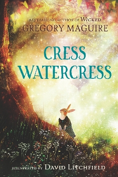
From the author of Wicked comes Cress Watercress, a charming woodland adventure with lush illustrations by David Litchfield. The author-illustrator duo chats with SLJ about the collaborative process and teaching children the constant possibility of change.
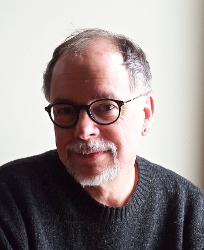
Gregory Maguire:
 As an author of many adult and children’s novels, you have introduced readers to a myriad of fantastical characters. In Cress Watercress, you weave numerous woodland creatures into one adventure, and each one is so unique. How do you keep everyone’s distinct voice straight, and where do you find inspiration for their personalities?
It’s terrible to say that I see a little skunk in everyone, so I won’t; but Lady Agatha Cabbage: C’est moi. In fact, the emotions of the woodland animals—Cress’s longing for her father, her mother’s worry, the owl’s pride, the squirrel’s squirreliness—they are all me. Books do sound in my mind like a radio play when I’m writing them, and characters want to sound as if they come from the same world but are different, too—that’s as much for the author’s need to keep them straight as anything else. Why does Manny Crabgrass, the super, have a little Spanish in his vocabulary? I don’t know. But it makes him more him.
Cress vacillates between wanting her independence and needing the comfort of home and family. In what ways do you think readers might identify with Cress? Is she modeled after any children in your own life?
I realized a few years ago that one of my children was good at enduring the battles of the everyday, but that having mastered a difficult moment, was prepared to think it would never emerge again. The secret life cycle of emotions is something we don’t emphasize in teaching children about their feelings. Will I have a friend? Yes, you will, my darling! (And then you will need another one some other time, and worry about it all over again.) I hope that what readers see in Cress is a kind of instability of emotional state that they can identify with. We change all the time. All. The. Time.
Mama weaves colorful tapestries on her loom, and these beautiful crafts play a prominent role in the story. Are these weavings meant to be symbolic?
We weave the story of our life out of the material at hand, sadness as well as glee, dark tones to set off the silver and gold. That was my thought, that the tapestries were a way of saying: See every color and pattern your life has to offer you. And celebrate it! All the time! The Tree of All Seasons!
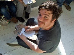
David Litchfield:
 How did you know what Gregory was looking for in the illustrations? Did you bring any new ideas to Gregory about the characters, like adding particular features to the illustrations?
The great thing about Gregory’s writing is that it’s all there on the page with his incredibly fleshed-out and developed characters. After a few initial sketches going back and forth between us, I soon got into the rhythm of what this book was and how it should look. But yes, it's mainly pulling a lot from the text and shaping the characters. Not just from Gregory’s great descriptive words, but also from the speech patterns and phrases he uses with the dialogue.
For example, one of my favourite characters is Agatha Cabbage. When we are introduced to her in the book, the first line she says is, “Oh, my pearls and pistols. What do we have here?” and I could just tell how someone who would use that line would stand, how they would position their hands and what their facial expression would be. This may sound odd, but I actually pictured Blanche Devereaux from The Golden Girls (a reference for the 80s kids out there) when I was drawing Agatha Cabbage; and yes, that very much sprang from the dialogue.
In terms of adding my own features, I did feel that Cress should have a hint of freckles. Now, obviously rabbits don’t have freckles, but these are patches of colour on her fur that just so happen to resemble freckles. Cress is going through some scary, emotional challenges, and she is having to act like a grown-up a lot in the story. But really she is a child. I thought that giving her ‘freckles’ would remind us that there is an innocent child behind the stern exterior.
You’ve worked with many different authors and have also written your own books. What do you need to know about an author or story before you begin your illustrative process?
To be honest, it changes from book to book. Some authors like to send me lots and lots of notes at the start about how they think the book should look. Others completely back away and let me just get on with it. With Cress, I read the book twice and then just dived into creating a bunch of sketches and ideas to send over to Gregory. I also sent a few versions of Cress to take a look at. Some of these were ultra stylised and kind of cartoony. Others were very much based in reality, albeit with animals wearing clothes and walking and talking like humans. It was obviously the latter style we decided would fit the story best. Once Gregory and the art director were happy with the sketches and the art samples, I went straight into creating the artwork. The process eventually came together fairly quickly once we established how the characters should look.
Read More: The Art of Co-authoring and Collaboration, a guest post by Katie and Kevin Tsang
What forms of media did you use when illustrating Cress Watercress? What does a day look like for you when you are illustrating a children’s book?
Oh, it was great fun. One of the funnest books I’ve drawn, in fact. Most of the images would take me 2 or 3 days to complete, although some of the ultra-detailed ones would take a little longer.
I like to experiment with textures a lot, so a big part of the process was taken up with making a mess with watercolour paints and just creating a lot of interesting and colourful washes to use as backgrounds and overlays. I also took a lot of close-up photographs of things like tree bark and sunsets. Once I had collected these many textures, I scanned them all into my computer and spent a fair bit of time experimenting with overlaying them with each other and just playing around with them. At the start of a project, I like working this way. It is a bit trial and error, as sometimes the results don’t turn out that good, but other times you can discover a beautiful, unique texture that just maybe makes the perfect sunset for a spread. Time permitting, I try to make as many different textures as possible for each of my books so that they have their own feel and atmosphere.
Gregory Maguire and David Litchfield:
 How did both of you end up collaborating on this project? How do you (Gregory) go about selecting an illustrator? What about David made him the right artist for Cress’s story?
DAVID LITCHFIELD: I was absolutely chuffed to bits to be asked to draw Cress Watercress. Even before I had read it, I knew that I would absolutely say "yes," and I jumped at the chance to work with Gregory. When I did read the manuscript, I absolutely fell in love with the characters, and I wanted to live in that forest with them all.
GREGORY MAGUIRE: My editor at Candlewick pre-selected five artists and asked for my opinion. While writing the story, I had something a little more traditional in mind, with black outlines and watercolor fill-ins. But among the selections provided, I wasn’t convinced anything that traditional worked. The color palette was too limited, the characterizations were too cartoony, etc. I liked David’s portfolio the best, but for this story I also liked a certain range and type of his work in some pieces more than in others. So I nominated David, but expressed that my interest in the intensely color-saturated pieces was high. I pointed out a few images that I thought caught the "Rouen-Cathedral-stained-glass-pulsed-in-a-Cuisinart-for-15-seconds" style perfectly, and that’s what I wanted. The whole world is holy, even the world full of danger and loss, and I thought David’s work when approached with that technique and ambition would serve beautifully. How much of my opinion was conveyed by the art director to David I have no idea—perhaps none. Perhaps the publisher trusted David to make sound choices without being hectored by the nudnik author. Whatever stratagem they chose to follow, the results are perfect. It’s one of the most beautifully illustrated total volume books I have seen in decades.
How does your author-illustrator process take shape? Does Gregory write the whole story and then David adds the illustrations, or are the illustrations created as the story is written?
DL: Yes, the book came to me pretty much fully formed. There were a few minor changes that happened whilst I was drawing it, but from my perspective I came aboard the project after the book had been written.
GM: I think there was precisely one word I changed in the final book because the picture didn’t exactly line up with a description. I just deleted the word. It was easier, and kinder, to remove the word than to ask David to redo a whole piece. And it made no difference to the story. Who am I to claim the authority here? I followed his work and revised my text. Maybe more than once—but not often, I concede.
As to corrections, the only thing I remember was finding images of decrepit buildings to show what Two Chimneys might look like. Again, I don’t even know if they were passed on.
How do you each influence the other’s work when you collaborate on a book? What changes occurred to Cress or her story as a result of your working together?
DL: To be honest, I would have felt a bit odd making too many suggestions that changed the story. The book was perfectly formed by the time I joined, and my visuals are very much a response to Gregory’s world that he has already created.
Having said that, I do try and offer some happy little surprises in my illustrations that both the reader—and yes, even the author—maybe were not expecting to see. Pushing some of the colours and textures in that forest was a conscious decision and an attempt to make the book stand out and feel different from other books.
My starting point for the artwork was The Wind In The Willows and the great illustrations by E.H. Shepard and also Arthur Rackham. There are still very much elements of that style of artwork in Cress Watercress, but I think adding a few of those surprises into each piece helps push the art in a new direction from the art that influenced me.
GM: I think I answered this above. I will say that I also had E.H. Shepard in mind—the Pooh stories as much as The Wind in the Willows. Also perhaps drawings by the great Garth Williams—not so much Charlotte’s Web as the picture books he did, like Scupper the Sailor Dog or the "Miss Bianca" series by Margery Sharp. The dreadful cat in The Turret—or is it The Rescuers?—is one of the great menacing ink drawings of the last century!

Added To Cart
RELATED


RECOMMENDED
CAREERS
The job outlook in 2030: Librarians will be in demand
CAREERS
The job outlook in 2030: Librarians will be in demand
ALREADY A SUBSCRIBER? LOG IN
We are currently offering this content for free. Sign up now to activate your personal profile, where you can save articles for future viewing
ALREADY A SUBSCRIBER? LOG IN
Thank you for visiting.
We’ve noticed you are using a private browser. To continue, please log in or create an account.

Add Comment :-
Be the first reader to comment.
Comment Policy:
Comment should not be empty !!!