


2018 School Spending Survey Report
What Makes a Good Picture Book Great? The Difference Is in the Details.
Artfully designed casewraps, endpapers, flaps, and even copyright pages bring young readers deep into a picture book's world and spark engagement.
 |
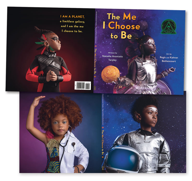 |
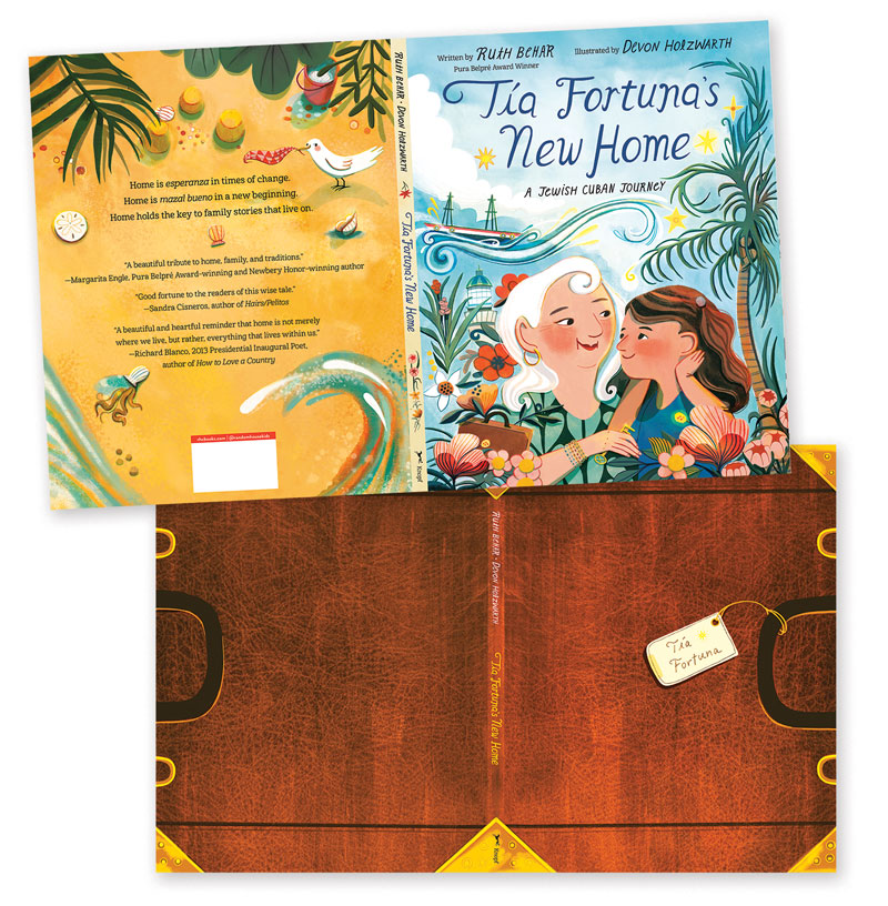
Dust jackets and casewraps for Tía Fortuna’s New Home and The Me I Choose to Be. |
|
This past December I got to fulfill a lifelong dream (well, a dream I’d had for a few years, anyway) of cohosting the annual Undies Awards with Travis Jonker and Carter Higgins. Now entering its seventh year, the Undies encourages readers of all ages to peel dust jackets off books and nominate which printed hardcovers—aka hardcases, case covers, or casewraps—have the best designs. Recognizing that this stellar form of secondary storytelling wasn’t just limited to casewraps, Travis, Carter, and I also launched the inaugural Endies Awards in 2022 to celebrate all the inventive endpapers illustrators are creating. Between the two awards, we saw hundreds of submissions from librarians, teachers, parents, and book reviewers, reinforcing the idea that noticing and appreciating these details is on the rise among readers. And with good reason!
“The unveiling of the differing case under the jacket is now a social media staple, a kind of literary adjunct of the unboxing video,” says Groundwood Books art director Michael Solomon. Readers get a chance to join in on the excitement, and there are a few key design categories in addition to Undies and Endies that are worth appreciating and discussing with students.
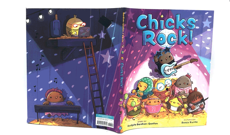 Casewraps and endpapers offer precious extra physical space to engage readers and extend or hint at the story they’re about to read. Consider the casewrap for Chicks Rock! by Sudipta Bardhan-Quallen and Renée Kurilla (Abrams, 2021), about a musical chick who finds her inner rock star with help from her friends. Jacket and casewrap are different, but complementary. The jacket shows various chicks rocking out; the casewrap, a more pastoral image of the same crowd. Together they convey the depth of the chicks’ group vibe, all before the book even opens:
 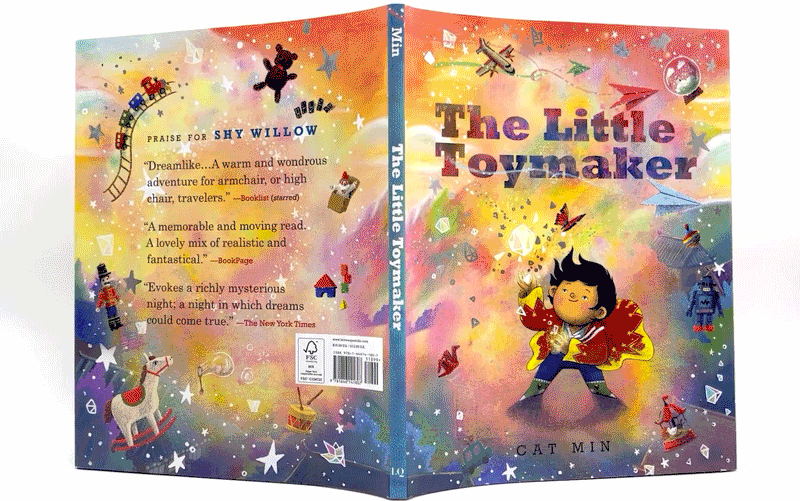 These chicks are a team that values friendship.
Arthur A. Levine, founder and editor in chief of Levine Querido, says a book’s casewrap/dust jacket combo is key to introducing the story and drawing readers into its world. “The narrative information begins not with the text but with the jacket image, in the same way films start affecting you right away, not just when the characters are talking.”
The shiny jacket for Cat Min’s The Little Toymaker (Levine Querido, 2022), a holiday book about a boy who makes toys for older people, shows toymaker and toys against a burst of colors. Peel it off and you’re further transported into the magical 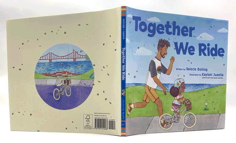 world set up by the jacket: The casewrap shows more toys suspended against a galactic, candy-colored field. Readers know to expect the same colorful playfulness from the rest of the book.
Literally and figuratively, casewrap/dust jacket combinations come in all shapes and sizes. Sometimes there’s a general theme or tone for readers, as with The Me I Choose to Be (Little, Brown, 2021) by Natasha Anastasia Tarpley, Regis Bethencourt, and Kahran Bethencourt. Vibrant photographs show various children living their dreams, from becoming an astronaut to working as a doctor or an artist. Other jacket and casewrap duos introduce some of the main characters, like the bicycling family in Together We Ride (Chronicle, 2022) by Valerie Bolling and Kaylani Juanita.
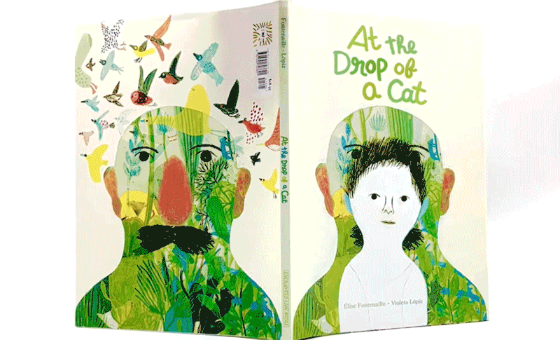 Casewraps offer a thread for readers to hold onto from the get-go. You can follow a detail, character, or pattern from the casewrap all through the story, like the grandfather and grandchild in At the Drop of a Cat by Élise Fontenaille and Violeta Lópiz (Enchanted Lion, 2023), in which a child spends time with their grandfather, a gardener imparting wisdom and stories. The casewrap reflects the focus on the two characters and foreshadows the end—and the passing on of stories and experience from one generation to another.
Then there’s Nancy Vo’s hilarious jacket/casewrap combination for Boobies (Groundwood, 2022). The jacket features a blue-footed booby “wearing” the title of the book, while the casewrap shows the title “falling” off the bird, leaving it exposed as 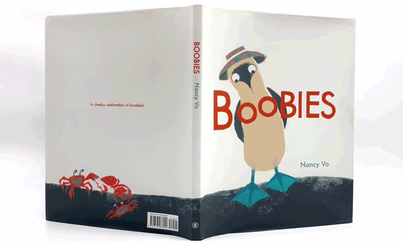 the booby stares out at the reader. The progression tells readers everything they need to know about the tone of the story they’re about to read: This will be a funny book with a lot of booby humor.
Readers can glean a lot about the story just by comparing a book’s jacket and casewrap; a notable example is Tía Fortuna’s New Home: A Jewish Cuban Journey (Knopf, 2022) by Ruth Behar and Devon Holzwarth. The jacket image of an older woman talking to a child suggests that she is recounting a story. The casewrap, of an old-fashioned suitcase with Tía Fortuna’s name tag, hints that the woman’s own journey will be central to the tale.
 |
Endpapers from H Is for Harlem and Berry Song; Below Left:the spine for Nothing Rhymes with Orange |
Endpapers
While it’s the cover’s job to encapsulate a story’s tone and draw readers in, endpapers introduce its unique world. Front endpapers “set the scene for the adventure to come,” says Alice Curry, Lantana Publishing founder and CEO. “Back endpapers can round off the narrative and transition the child back to the everyday world of home and school.”
In Maybe You Might by Imogen Foxell and Anna Cunha (Lantana, 2022), the endpapers reveal the story arc. A child plants a seed in a bleak desert, and that seed grows into a lush home for wildlife with flowing water. Endpaper art bookends this journey, with a child standing in a desert at the start, and overflowing greenery and water at the end.
As Solomon says, endpapers signal the start and closing of the reader’s time in that book’s world—“like the curtain in the theater.”
If you want to launch an endpaper discussion with students, proceed as if you’re taking a first step into that world. If the front and back ones are different, what predictions can readers make about the story or characters? Many endpapers feature before-and-after scenarios. What must take place during the story to get from one point to the other?
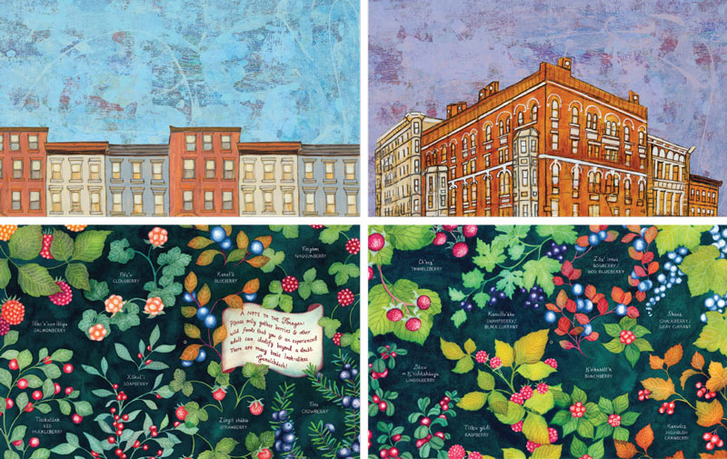
April Harrison’s endpapers in H Is for Harlem by Dinah Johnson (Little, Brown/Christy Ottaviano, 2022) use a classic trope of day and night, showing different buildings set against the sky. The endpapers bookend this day-in-the-life story of being in Harlem, with its diverse, vibrant architecture and culture. Night Lunch by Eric Fan and Dena Seiferling (Tundra, 2022) takes the same day-and-night endpaper approach.
Michaela Goade’s decorative endpapers in Berry Song (Little, Brown, 2022) serve an informational purpose, with various illustrated berries labeled in Tlingit and English.
Readers can also circle back to endpapers with a new perspective after finishing the story. Were their initial predictions correct? What new details do they notice now? Why do they think the illustrator chose these images?
Endpapers “encourage creative thought and multiple readings of a book,” notes Diane Early, Charlesbridge Publishing creative director.
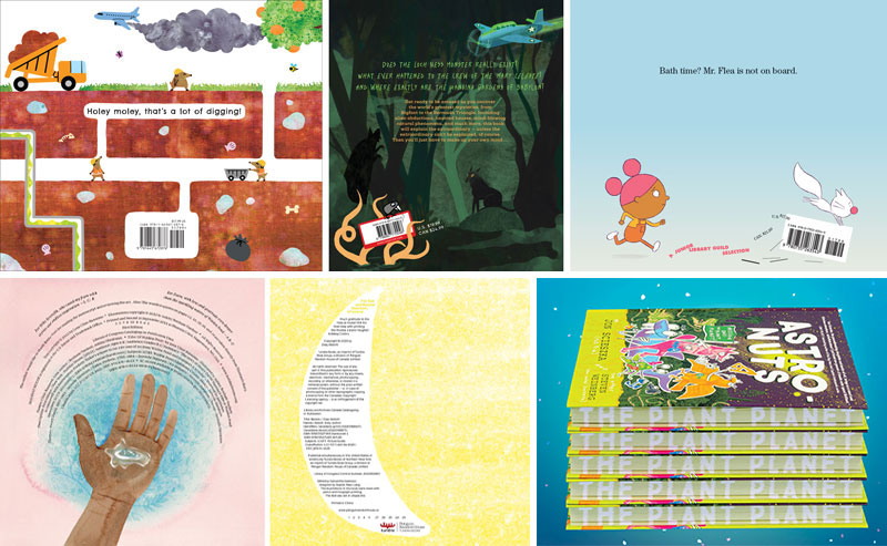 |
Top, left to right: Barcode design from Moles Present the Natural Tolls of Digging Holes by Springer Badger, The Big Book of Mysteries by Tom Adams and Yas Imamura, and How to Give Your Cat a Bath by Nicola Winstanley and John Martz; Bottom, left to right: Copyright pages for Of Walden Pond and Banana; fore-edge art on “AstroNuts Mission One” by Jon Scieszka, illustrated by Steven Weinberg. |
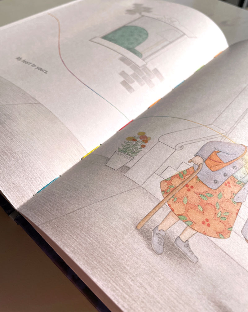 |
Rainbow thread binds together the pages of Heart String by Brooke Boynton-Hughes |
Designing all “real estate”
From a publisher’s standpoint, casewraps and endpapers are just the tip of the iceberg when it comes to enhancing the story.
“Every piece of real estate—spine, endpapers, flaps, case, binding dye, jacket flipside, paper texture, title/copyright page, etc.—is up for grabs,” says Dan Potash, creative director at Simon & Schuster’s children’s division.
Every book must have a page with copyright information; giving it artistic flair offers another immersive layer for readers. Consider Of Walden Pond by Lesa Cline-Ransome and Ashley Benham Yazdani (Holiday House, 2022). The copyright information forms a circle around a hand, like ripples on the book’s titular pond.
In Milo Is Missing Something by Vern Kousky (Random House Studio, 2021), copyright information is shaped like a set of bubbles, reinforcing the fact that we are reading a story that takes place underwater.
 And then there’s Banana by Zoey Abbott (Tundra, 2023), where the copyright info is in the shape of —you guessed it!—a banana.
The frontmatter in A Natural History of Fairies by Emily Hawkins and Jessica Roux (Wide Eyed Editions, 2020) makes readers feel as if they’re experiencing someone else’s journal, while the backmatter in Mae Makes a Way: The True Story of Mae Reeves, Hat & History Maker by Olugbemisola Rhuday-Perkovich and Andrea Pippins (Crown, 2022) cleverly entices readers to stay and learn more after “The End.”
Sometimes design elements are woven in so organically that readers don’t notice. Is the barcode printed in a standard way, or does it suggests something more about the story inside?
Ask readers what they think a special binding conveys about the book, and how it ties back into the larger message.
Occasionally a book’s fore-edges (the edges of a book’s pages) will have a special design treatment, such as foil, bright color, or printed image. Ask readers how this further enhances the story’s world.
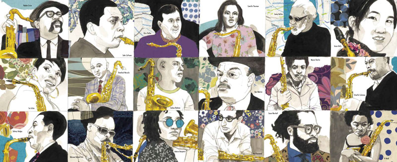
Some publishers are including printed posters on the underside of their dust jackets, too, like the one on the flipside of the dust jacket in The Story of the Saxophone by Lesa Cline-Ransome and James E. Ransome (Holiday House, 2023).
As for the spine: This part of a book is highly utilitarian, but it too can say a lot in a small space—while trying to make a big impression a shelf. The spine of Nothing Rhymes with Orange by Adam Rex (Chronicle, 2017), for example, is designed to look like a grocery bag.
So challenge yourself and your readers to peel off the dust jacket and explore all the design trappings around a story. Chances are, getting to know these features of a book will make it a favorite for years to come.
 |
A poster included in The Story of the Saxophone |
Mel Schuit blogs about children’s book illustration and design at “Let’s Talk Picture Books.”

Added To Cart
RELATED


RECOMMENDED
CAREERS
The job outlook in 2030: Librarians will be in demand
CAREERS
The job outlook in 2030: Librarians will be in demand
ALREADY A SUBSCRIBER? LOG IN
We are currently offering this content for free. Sign up now to activate your personal profile, where you can save articles for future viewing
ALREADY A SUBSCRIBER? LOG IN
Thank you for visiting.
We’ve noticed you are using a private browser. To continue, please log in or create an account.

Add Comment :-
Be the first reader to comment.
Comment Policy:
Comment should not be empty !!!