


2018 School Spending Survey Report
Behind-the-Scenes: The Making of an SLJ Cover Illustration
How does an SLJ cover come together? Read and see what happened to create the cover of the September issue with illustrator Thomas Pitilli. And watch Pitilli's process video for even more insight.
 School Library Journal staff takes great pride in our print issue covers, which aim to be engaging art in their own right while conveying content in a way that draws readers into a story inside the magazine.
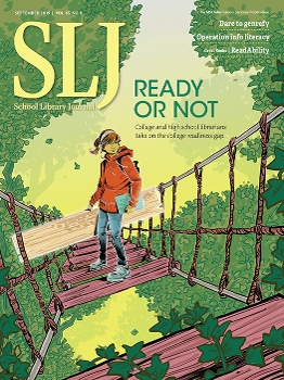
The best images evoke emotion and, combined with the headline, prompts subscribers to contemplate the idea of an article before they even begin reading the story. We thought it would be fun to take you behind-the-scenes of the process with a look at how illustrator Thomas Pitilli’s September cover image of a young woman crossing a rope bridge came to be.
The first step: selecting an illustrator
SLJ creative director Mark Tuchman is the lynchpin in the process each month, the guiding hand from illustrator selection through the back-and-forth between editors and artist about drafts to the final image and cover headline.
“I see my role as the liaison between the artist and the editors,” Tuchman says. “I serve the editors, and I champion the artist.”
When a cover article is selected from the month’s feature stories, Tuchman reads it through his creative director’s lens.
“My purpose in engaging with the material early on is solely to figure out what style of illustration and what kind of ideas seem to serve the story best,” he says. “It helps me choose the illustrator. I always pitch a few illustrators to the editorial team to see if there is consensus, and often there is.”
Selecting the right illustrator, Tuchman says, is the most important part of the process. For the September cover, which represented multiple stories about college readiness, some incorporating the results of SLJ’s Information Literacy/College Readiness Survey, he wanted to focus on the emotional aspect of a student whose librarian helped her become college ready. Tuchman included Pitilli in the illustrator suggestions he sent to the editors because of Pitilli’s “authentic portrayals of young people” and characters who are both modern and timeless, Tuchman says.
Pitilli is an illustrator and comic book artist from Brooklyn, NY, whose primary work is as an artist on the comic series Riverdale from Archie Comics. His illustrations have also appeared in publications such as The New York Times, Wall Street Journal, Entertainment Weekly, Playboy, Washington Post, Variety, Hollywood Reporter, and more.
“Thomas captures so much in expression and body language,” says Tuchman. “All of these factors made him ideal for a cover that needed to rely on connecting with the experience and perspective of the student being portrayed.”
The editors agreed Pitilli would be the best choice and Tuchman contacted him, hoping the prolific comics illustrator was available and willing to do it with the tight deadline of one week.
“To be honest, a full week is kind of a luxury,” Pitilli says. “Things move very, very fast.”
Having worked with Tuchman for SLJ in the past—as well as creating an award-winning cover image for our sister publication, Library Journal—Pitilli happily agreed to take on the September cover.
Watch Pitilli work through the process and hear more details about how he collaborated with SLJ’s creative director Mark Tuchman to create SLJ’s September cover in this video.“I’m so glad Thomas made this instructional video using the SLJ cover process as his example,” says Tuchman. “Illustrators who are starting out will learn all of the key points to a successful collaboration by doing what Thomas does.” |
What’s next?
Once an illustrator is selected, Tuchman sends a draft of the story, a cover template, and any other information he deems would be helpful without tying the hands of an artist. (He won’t, for example, suggest his own ideas or thoughts he had about visuals.)
This is where the artist’s particular process takes over. For Pitilli, that means reading the story and creating word association lists and sketches.
“Thomas is a talented illustrator with a great style, but that’s not all that’s needed to end up with a successful cover,” says Tuchman. “What really impresses me with Thomas is how he digs deep into the materials to understand them, and is then able to translate the heart of the story into strong, relevant visual ideas.”
In his sketchbook, Pitilli will write down key words as he reads the story. Then, he’ll associate those main words with others—for example, "student" becomes the top of a list that includes words such as laptop and backpack.
“After that word association process, I made really rough sketches that probably only I can decipher at that time,” he says. “I’m just trying to move very quickly in that moment. From those, I then make more refined sketch ideas that I know I will be sending to Mark.”
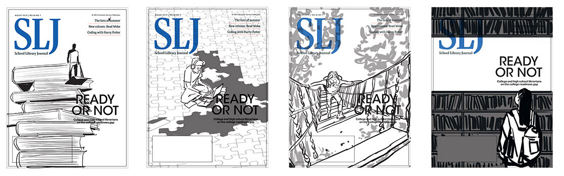
From there, he chooses the ones he likes best and goes to work on digital drafts of a few different ideas.
“I think most art directors are expecting several ideas,” he says. “Mark and I have worked together before; he knows I’m not just going to send him one idea. It works out for both of us, because sometimes what winds up happening is there’s a little piece of one idea and another piece of another idea and a good art director would be able to say, ‘What if we put these two together in an interesting way?’ Sometimes I’ll work within one theme. I was really adamant about that bridge theme, I might do three different versions of that. For this one, I did a lot of individual different ideas.”
He sent those off to Tuchman and awaited a response.
Collaboration
An illustrator’s cover drafts are just that—drafts. From there, Tuchman shows the editors and takes their thoughts back to the artist, along with any feedback he might have.
“It’s critical that I convey the editor’s concerns accurately to the artist and that I represent the artist’s intentions to the editors,” he says.
Feedback is a significant aspect of the gig. Pitilli doesn’t just handle it without ego; he says he enjoys the process.
“It’s so much part of the profession to make revisions and to compromise on ideas,” he says. “That’s why I like working with good art directors like Mark, because I trust he’s not going to completely destroy an idea. If anything, he’s going to add to it. That, in itself, is definitely a luxury. That’s not always the case. There is a collaboration aspect that I enjoy. I’ve come to accept that is a big part of the illustration process. I’m not super adamant about 'this is a masterpiece, you can’t change it.'”
In this case, Pitilli had focused on one takeaway of the stories: students aren’t as prepared as they should be when they go to college. The body language and overall feeling of his drafts were more negative than Tuchman wanted.
“Sometimes faithfully representing the material may not make for the most compelling cover,” says Tuchman. “In this case, Thomas was spot on in showing the struggle kids have with the college-readiness gap—the articles lean this way. But it was feeling like too much of a downer. This wasn’t an article that needed to be framed by the negative. Our readers want to help kids succeed, so showing the more aspirational perspective made sense and would give the librarian more motivation to read the articles.”
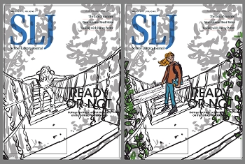 Tuchman conveyed this to Pitilli and suggested just a change in the body language of the character—from looking defeated and unprepared to determined and empowered by a librarian’s assistance and ready to tackle that college readiness gap.
“I really loved that suggestion that Mark gave because when I was reading the article, I was picking up on a lot of the negative aspects, so I thought I’ll show that aspect,” he says. “But Mark understands the demographic of the magazine much better than I do and was a little more nuanced with the article in terms of 'How about we show it is scary but there’s a happy ending on the other side?' For me, that was great, I was like ‘That’s awesome I would love to make it more positive.’”
After that phone conversation, Tuchman says he knew the finish line was in sight. But, there was actually one more little touch.
“I’m not sure most people will pick up on it, but on the other side of the bridge, he had an idea to add ivy wrapped around the bridge and that could potentially suggest Ivy League, higher education,” says Pitilli. “It was his idea. I thought that was great. That was a visual element I would love to have thought of myself. That was a really nice collaborative moment.”
With art completed, Pitilli gives up control to Tuchman and the editors, who will decide typeface and color and the wording of the cover headline.
“As far as typefaces go and all that, yeah, it’s not in my control,” Pitilli says. “Most of the time, I’m very pleased with it. I’ve had very few instances where I feel like the type ruined the image. It happens from time to time.…The clients I work with [now], for the most part, I’ve been working with for several years, so I’m comfortable. There’s a trust element. I know they’re going to make it look really good.”
The final result
The young woman, board and laptop in hand, conveys determination and appears confident ready to cross that bridge to college, thanks to her librarian’s help. The cover headline: "Ready or Not: College and high school librarians take on the college readiness gap."
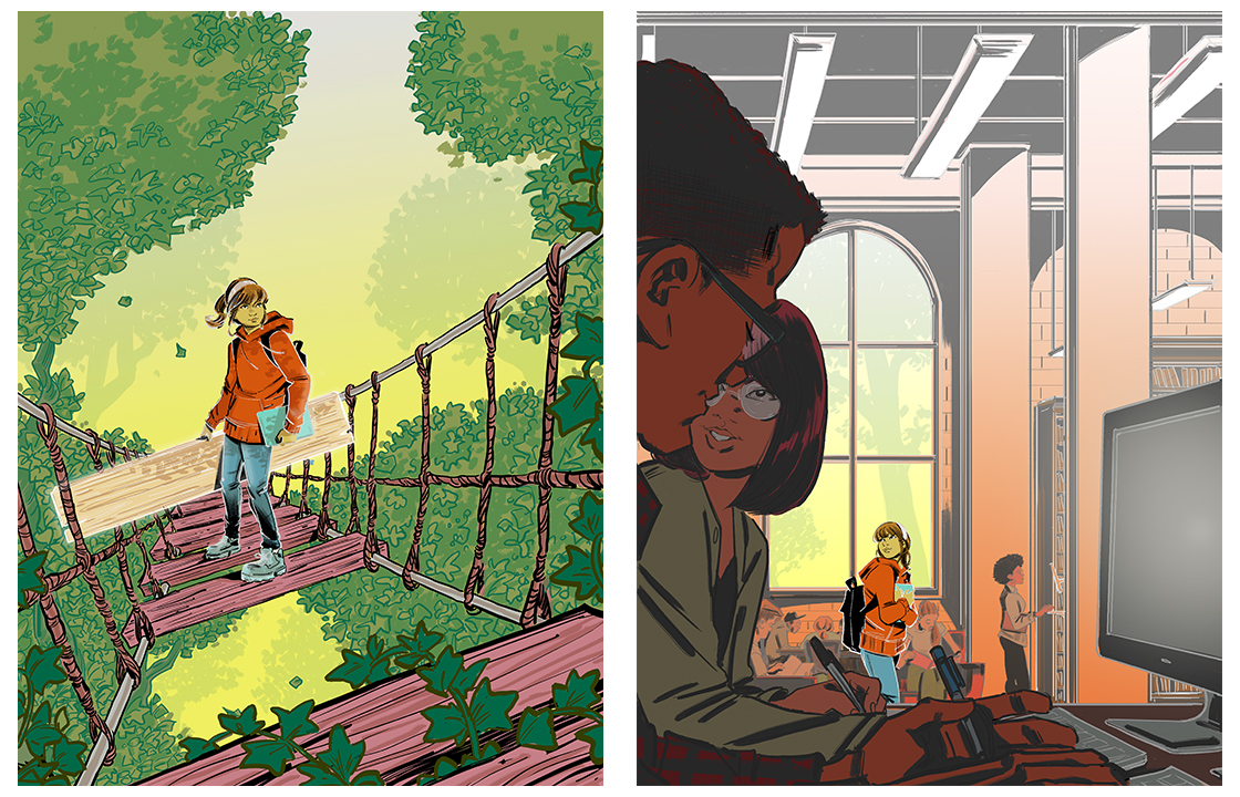 |
| Pitilli's final cover art (left) and the cover story opening illustration. |
“I am thrilled with the cover,” says Tuchman. “By the time Thomas was given the 'go to final,' it was already clear we had a winner. Thomas nailed each step of the process: understanding the material, presenting strong visual ideas in sketch form, being responsive to direction, and of course, rendering the final art so masterfully."
Pitilli was happy, too.
“I loved it,” he says. “This was very satisfying at the end. I added it to my website immediately because I’m proud of it. I don’t do that all that time. For me, it goes hand in hand with some of my comic book covers, so this is a great one.”

Added To Cart
RELATED

RECOMMENDED
CAREERS
The job outlook in 2030: Librarians will be in demand
CAREERS
The job outlook in 2030: Librarians will be in demand
ALREADY A SUBSCRIBER? LOG IN
We are currently offering this content for free. Sign up now to activate your personal profile, where you can save articles for future viewing
ALREADY A SUBSCRIBER? LOG IN
Thank you for visiting.
We’ve noticed you are using a private browser. To continue, please log in or create an account.
Add Comment :-
Be the first reader to comment.
Comment Policy:
Comment should not be empty !!!